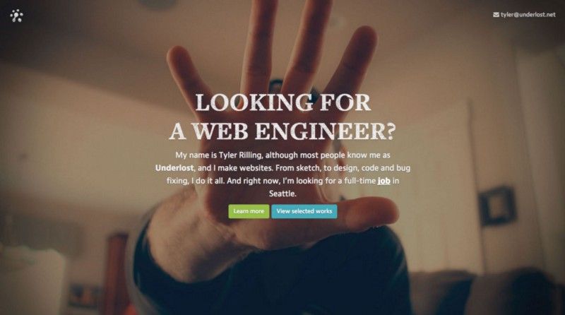
I never really realized how often I redesigned my site until I started looking back. In a lot of ways (besides acting as a portfolio), my site has always acted as my lab. An ongoing experiment of sorts.
Whenever I had some free time and a new idea, I used it as an opportunity to explore. Some things worked, some things didn’t. But it was always an interesting learning experience that created interesting results. Below are some of those results.
1999–2002
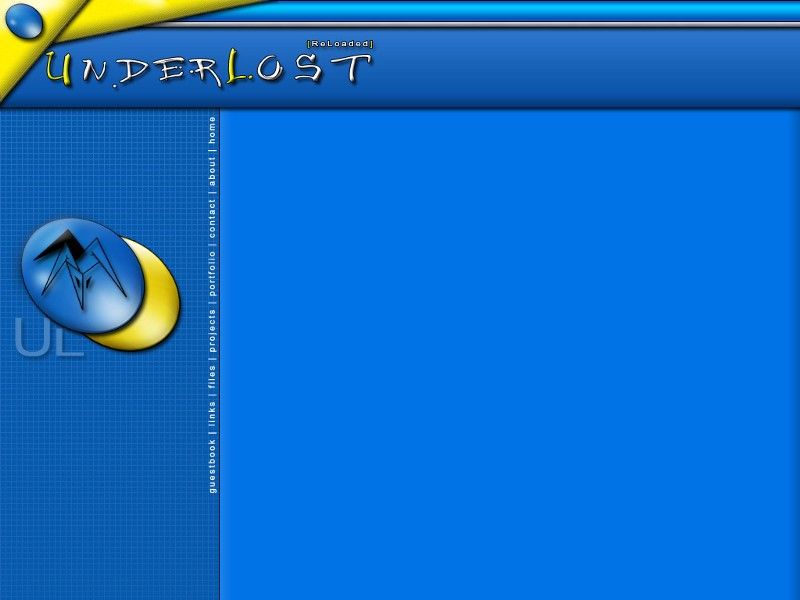
This is one of the first designs I still have for the original underlost.net dating back to high school. At the time, it was mostly just keeping a log of what was happening at school and social life. Before social networks were really much of a thing, I also featured a one of the most iconic features of the 90's- a guestbook for friends to post comments or leave messages. In a way, the site was sort of my own personal web portal. Not to mention, while everyone else was still using floppies and CDs, the site doubled as a file server to save/download school work to.
2002–2004
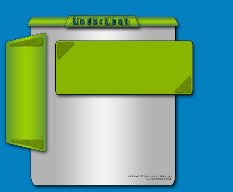
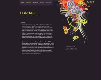
I can’t help but look at those shadows and gradients ask myself what the hell was I thinking. Honestly, how did I ever think this was good? Just look at those thick line strokes…and the dumb kanji that I somehow translated into what I thought roughly translated to ‘underlost’. And that. font. Ugh. I did a lot of dumb things in high school, but this design was up there with the worst offenders. It’s one redeeming quality is probably the color scheme and the weird looking triangle things in the corners it has going on.
2004–2007
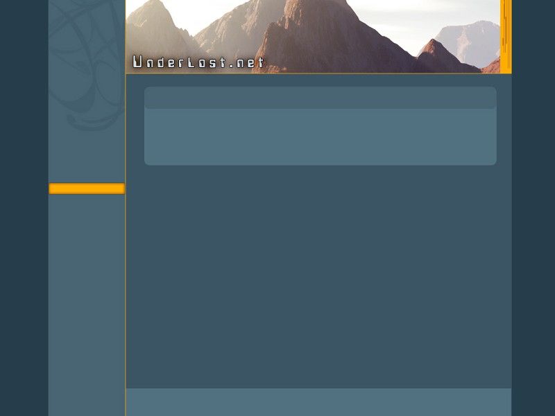
This design will always remain one of my favorites. I like to think I got into ‘flat design’ before it was ever really even a trend. I was fresh out of high school, and I wanted to make a more professional appeal for myself. At the time I was also getting into 3D rendering, so I took the opportunity to show off some of my work in the header of the design. Overall, it’s a little dated, but I like to think it still holds up pretty well with a lot of blog designs you see today.
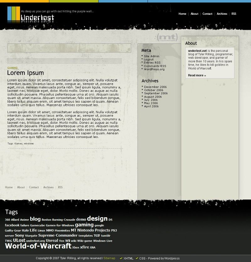
2007
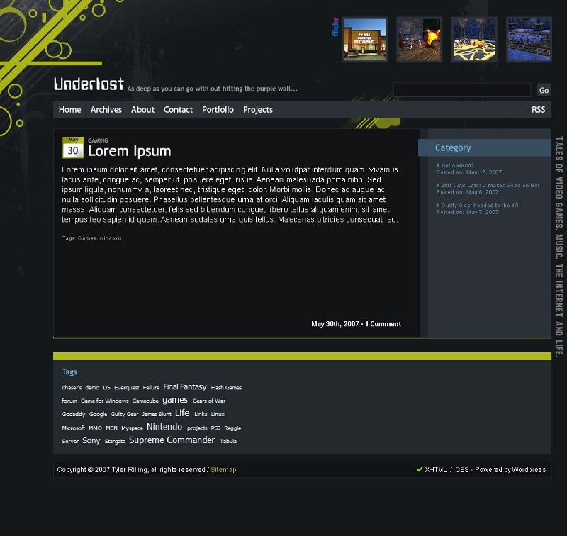
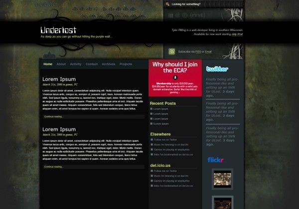
The start of my ‘grunge’ design phase, like much of the internet’s design phase at the time. Despite putting a fair amount of work into this, I never actually used it. Im not really sure why. I really liked the color scheme. Some smaller details like placement of the flickr content, or tags could be improved, but overall the sidebar has enough space that could have accommodated just about any blog widget.
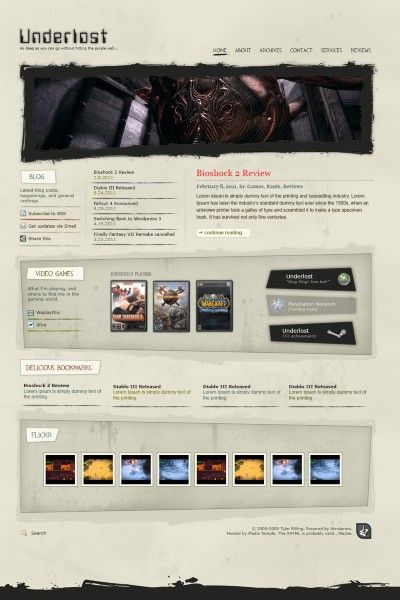
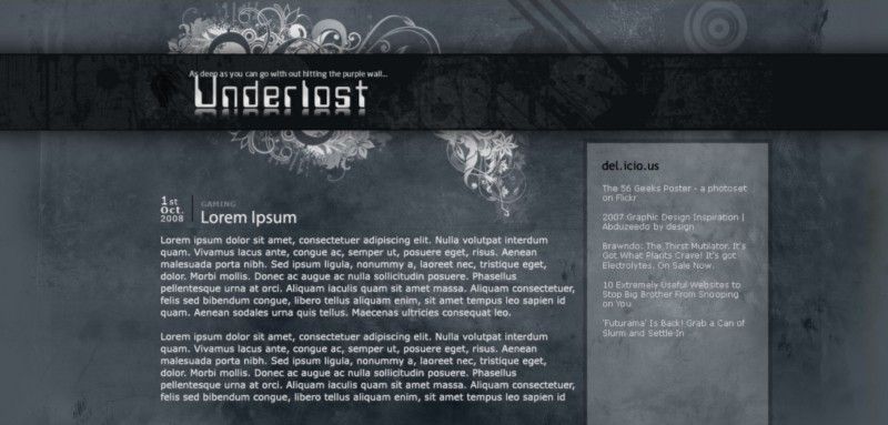
2007
I somehow thought this was better than the previous attempt. I guess at the time I wanted to start stepping away from darker designs and go with something lighter. This also marked my departure from Movable Type as WordPress had started gaining traction, and had become slightly easier to maintain.
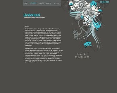
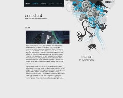
2008
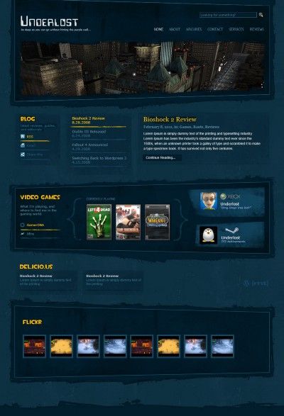
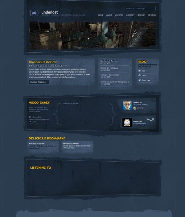
Not content with the last design, I almost immediately set off to make something better in between client work and raiding in World of Warcraft. I really loved the idea of a single page design; or at least, putting all the most important content on the front page, and moving the blog into the background. It also doubled as an activity stream. Just looking at the front page, the idea was to be able to see what I was up to. Not just with writing, but what I was playing, listening to, and where else you could find me online.
Never actually used, these were just some more fun experiments.
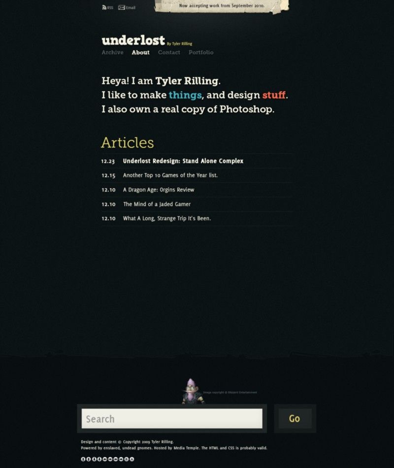
2009
In 2009 I really wanted to get back into blogging again. I thought the solution would be to strip away most of the design and take an even more minimalistic approach. Or at least that’s what I told myself. I played around with a few variations in colors, but nothing really stuck. I did really love the design I came up with through, so the space invader art continued to live on in other projects, like 404 pages and random easter eggs on other sites.
2010–2012
Finally abandoning that font, I went with an even more minimalistic approach and added some web fonts for both the content and logo. As an easter egg, doing the Konami code (as pictured on the bottom in the footer), would cause a bunch of random floating bokeh to appear. Because why not? Who doesn’t love a little easter egg and bokeh every now and then?
2012 -2013
Around 2012, I started developing a custom CMS for a client. While building it out, I decided to use my own site as a guinea pig for testing it live. Even though it got me writing more again, and while I did use the CMS for a few clients, I decided to abandon the idea to use it my site altogether and go in a different direction- to abandon the blog altogether, and go with something a little simpler, and more of just a portfolio based design. Which leads us to…
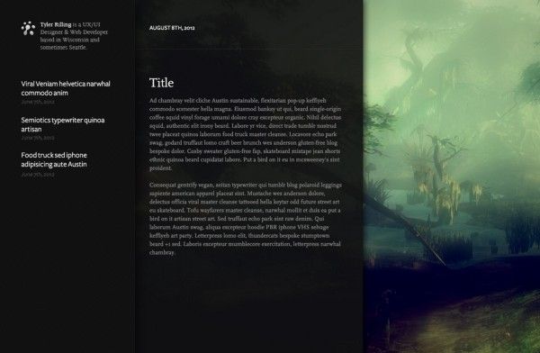
2014
Sort of coming full circle, 2014 marked the return to static html files with the use of Jekyll. Combined with a little PJAX magic, it kind of gave the illusion it was a single page site. And with getting heavier into photography, the backgrounds of each page featured large full screen image backgrounds (and retina friendly to boot!). I’m still incredibly proud of this site. I even wrote an in-depth post about it you should probably check out. It also lives on at v5.underlost.net.
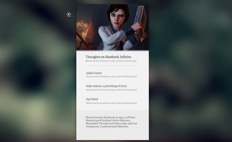
2015
And the best for last, the current design. Although it isn't too much of a departure from last year’s. It’s still Jekyll based with that PJAX magic, and it still focuses on large images for backgrounds with similar pages and content. The only major difference is now there’s a little more writing, and the layout is a little more refined. Best of all, I made my build process open source on Github.
What will be in store next? It’s hard to say. But I know I’d like to stick to the trend I've inadvertently set for myself and make something new again next year. Or at the very least, reiterate on what I already have again.
For more information on the project itself, head over to:
https://github.com/underlost/underlost.net/